Core Components
ℹ️ Compose Components Demo: This interactive playground showcases the 24 Compose UI components bundled in the Kolt suite. These components are supplied by the two Compose libraries in the suite: compose-kmp (KMP Compose tokens and squircles) and compose-utils (Android-only scaffolds and dropdowns).
Text Helpers & Components
KMPSpecialized text widgets supporting click-to-copy, ellipses with "read more" expansions, and image alignment.
AppspirimentText
Basic text wrapper supporting selectable text containment & offsetAppsCopyableText
Click text block to copy to clipboardAppsExpandableText
Limits text lines with click to expand toggleAppsImageText
Perfectly centered inline icon/image alignmentKeyValuePairText & PrefixedText
Formatted text fields for summary viewsHighlight Search Text
KMPText view that highlights instances matching the search query. Try typing in the search bar below.
AppsHighlightText
Highlighted matching terms inside target text blockKotlin Multiplatform (KMP) simplifies cross-platform sharing of business logic. Developers write common code once, and compile to Android, iOS, Desktop, and Web. Appspiriment's convention plugins make KMP project builds consistent.
Images & Avatars
Images, icons, and initials avatars supporting high-contrast tints.
AppsIcon
Standalone static system icon componentAppsImage
Standalone static graphic image component wrapperAppsAvatar
Circular name initials avatar badgeCircleIconBox
Centered icon tile with automatic contrast backgroundThemed Form Fields
Premium form text field inputs with full focus borders, clear functionality, and validation feedback.
AppsTextField
Standard text field for single line entries (Active & Disabled)AppsPasswordTextField
Input text with visibility eye action toggle (Active & Disabled)AppsSearchTextField
Search field with leading lens and trailing clear actionAppsValidatedTextField
Input field with validation states (Success & Error feedback)AppsDropdowns (Dropdown Selection)
Showcases of dropdown widgets: text, icon, floating label, and chip styles.
AppsTextDropDown
Outlined button trigger displaying active valueAppsIconDropDown
Clean settings menu list triggered from an icon buttonAppsDropdown (Floating Label)
Text-field design with animated floating label and state chevronChipDropDown
Pill-shaped filter button selectorAppsSlider (Value Controls)
Premium custom slider controls supporting interactive value drags.
AppsSlider
Drag active thumb handle to adjust numerical settingsAppsRatingBar (Star Rating)
Interactive star ratings supporting fractional parameters.
Interactive Rating Bar
Click/Tap stars to assign a rating valueRead-only Display
Static star rating containing half filled valuesAppsBadge & AppsTooltip
Count indicators and inline help prompts showing on interaction.
AppsBadge
Notification count pill badgeAppsTooltip
Interactive inline information popupsProgress & Loaders
Themed linear progress, circular progress, and indeterminate states.
AppsProgressBar
Linear progress bar (Determinate value)AppsCircularProgress
Indeterminate circular spinnerAppsLinearProgress
Indeterminate linear loading animationShimmer Skeleton & Empty States
Smooth loading placeholders with moving gradients and clean empty-state templates.
ShimmerBox Loading State
Dynamic loading state toggleAppsEmptyState
Centered dashboard block template for empty statesNo Tasks Found
You have completed all items in your workflow.
AppsDivider & Spacers
Visual and layout helpers for separating components cleanly.
Divider & Spacer Layout
Render separation lines and adjustable spacesAbove Text Block
Below Text Block
TextTitledCardView & Smooth Corners
Curvature continuity (G2) mathematically blended corners.
Smooth Corners Playground
Compare standard CSS borders against squircle curvaturesGeneric TitledCardView
Showcases TitledCardView using the custom title slot directly, allowing custom layouts in the title header block.
AppsAccordion (Collapsible panels)
Sleek expandable panels utilizing G2 smooth corners.
Collapsible Panels
Click headers below to slide open accordion itemsScaffolds & Page Structures
Previews of PageScaffold (toolbar + view) and AppsDrawerScaffold (toolbar + sliding navigation drawer).
Page & Drawer Scaffold Layouts
Toggle the hamburger menu (☰) on the right scaffold to slide open/close the drawerContent Viewport
A simple scaffolding structure containing a standard action bar and full content container.
Main content container
Toggle the hamburger menu (☰) above to slide open/close the navigation drawer.
SwipeableActionsBox (List Item Gestures)
Swipe left or right on list items to reveal context-specific actions (e.g. Archive, Delete).
Swipe Actions Preview
Drag the card items below horizontally to reveal green or red actionsAsyncStateBox State Machine
Renders dedicated slots depending on Idle, Loading, Success, or Error states of async operations.
Async Viewport State Controller
Displays correct slot depending on operational statusSmartPullToRefreshBox
Draggable viewport triggering suspending reload actions.
Pull to Refresh Feed
Drag down list below to trigger refreshing spinnerAppsStepper (Wizard Flows)
Flow-based progress layouts with node pulsing and transition lines.
Interactive Wizard Node Steps
Toggle back and next step buttons to slide active nodesCurrent step task: Add payment details
Step 2 of 3Native Overlay Controllers
KMPSimulated native viewports and bottom sheet cards.
Overlays & Sheets
Trigger dialogs and sheet controllers — available on all KMP targetsIn-App Updates (update-utils)
Android OnlySimulated dialog prompts driven by Google Play In-App Update / Firebase configurations.
In-App Update Dialogue Simulation
Test Google Play Flexible and Immediate flowsLocationPicker (Map, Search & Coordinates)
KMPAll-in-one location picker component with autocomplete search, maps selection pin, current location tracking, and manual coordinates entry tabs.
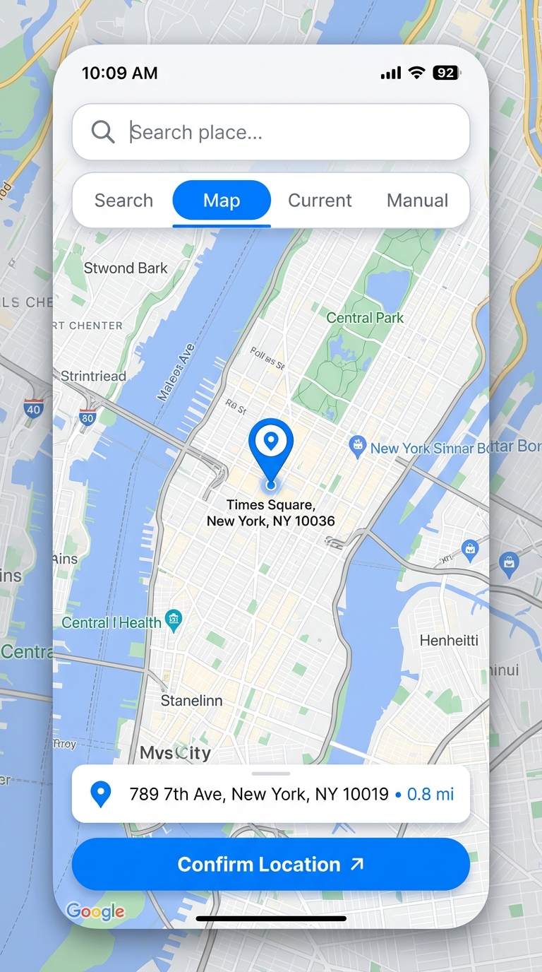
- Search Tab: Autocomplete location query search via place APIs.
- Map Tab: Drop map pins directly and resolve addresses (Reverse Geocoding).
- Current Location: GPS coordinates resolution (with browser Geolocation on Web).
- Manual Entry: Validation checks for latitude, longitude, and custom labels.
// Launch via Platform Expect/Actual API
LocationPicker.rememberLauncher(config) { result ->
    val latitude = result.latitude
    val longitude = result.longitude
    val address = result.label
    val timezoneId = result.timezoneId
}